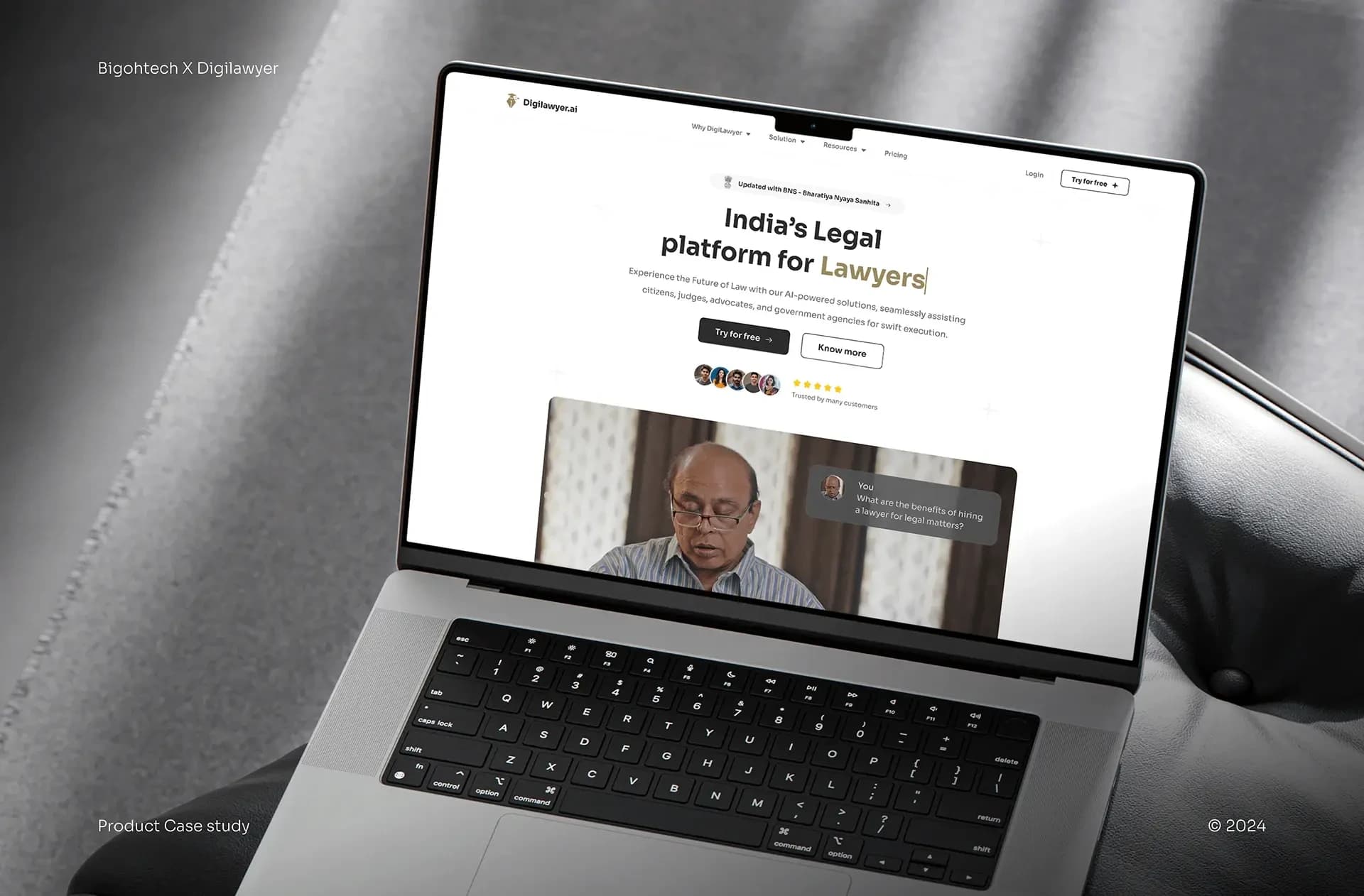
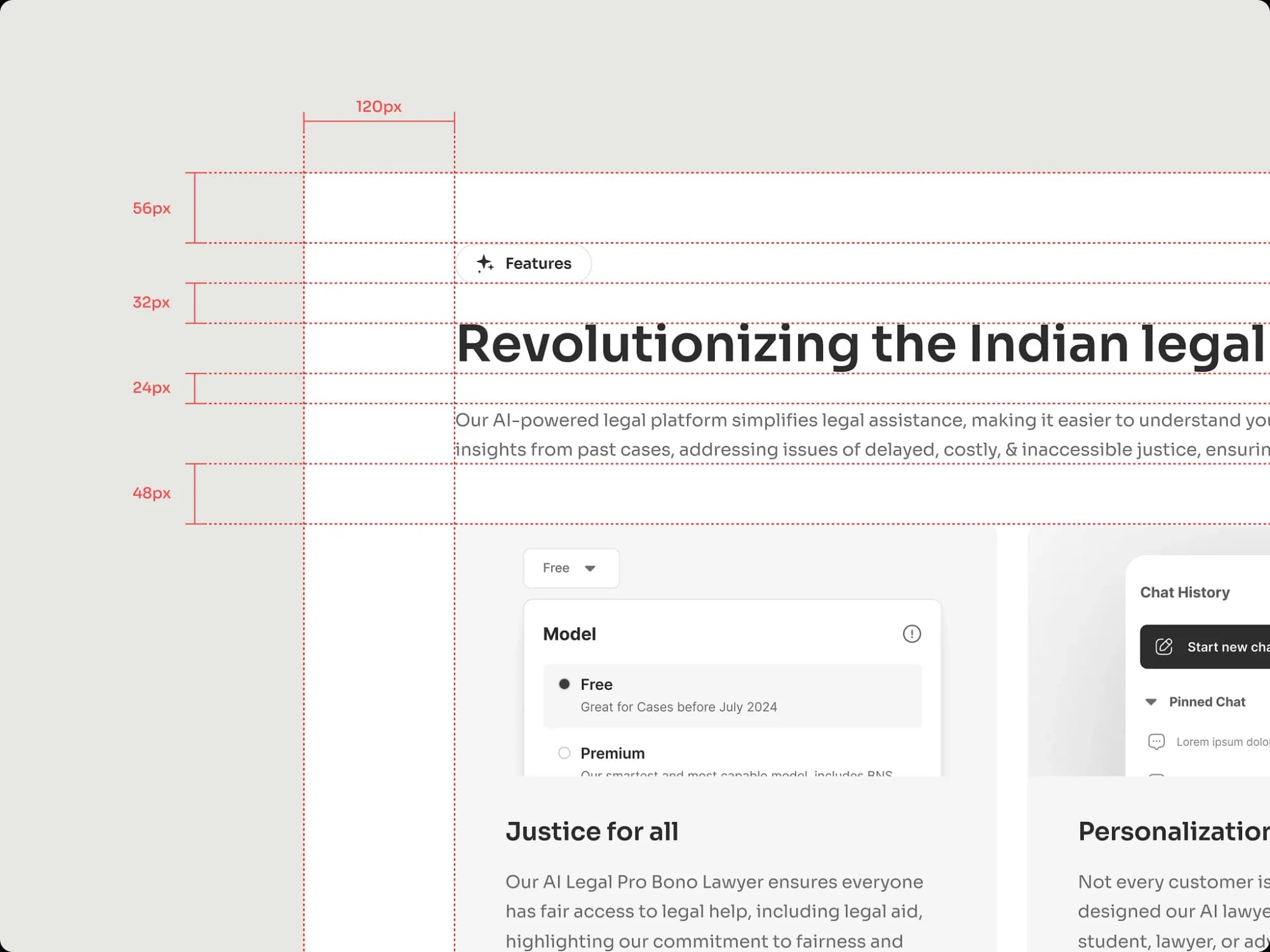
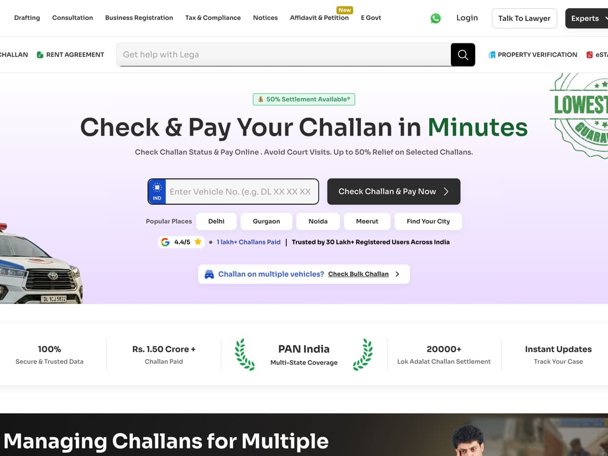
 2025–26 · DIGILAWYERDigiLawyer's challan page needed a phone call to sell. Now 3 in 5 paying customers never need one.B2CLegal TechConversionMobile-first27% → 42% of visits start a checkWith Nitansh Anand and the CEOFour form fields cut to oneView case study
BIGOHTECH × DESIGN SYSTEM • 2024–NOW
The system behind 14 products.
- ROLE
- Product Designer
- TIMELINE
- May 2024 – Now
- TEAM
- Me + EngineeringLater, 2 more designers
- SKILLS
- Design SystemsProduct DesignComponent Architecture
Figma link
Digilawyer Design System · view only
OVERVIEW
How do we ship multiple products without rebuilding the same UI every time?
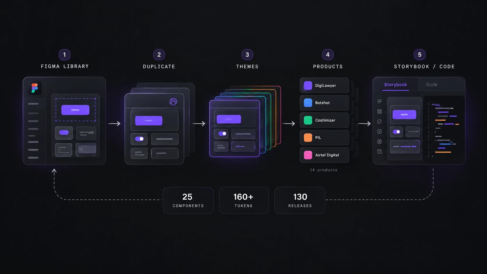
I started building the system alongside DigiLawyer, then evolved it into a shared foundation that now supports 14 products.
Build while shipping
Instead of stopping product work to build a system, I turned real product requirements into reusable foundations as we shipped.
Reuse and adapt
Once the foundation worked, we duplicated it for new products, changed the theme and adapted only what each product needed.
Improve through use
Designers and developers using the system exposed friction that I continuously fed back into the shared library.
PROBLEM
We were shipping products without a shared source of truth.
When I joined BigOh Tech, Botshot and Costimizer already existed and DigiLawyer was about to begin. There was no shared design system connecting them, so the same UI decisions were repeatedly designed, handed off and interpreted again.
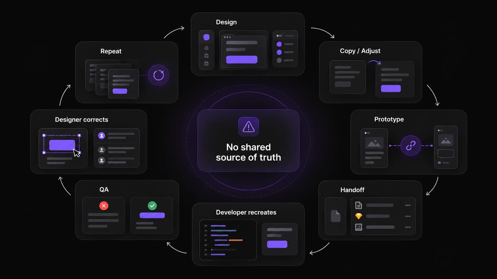
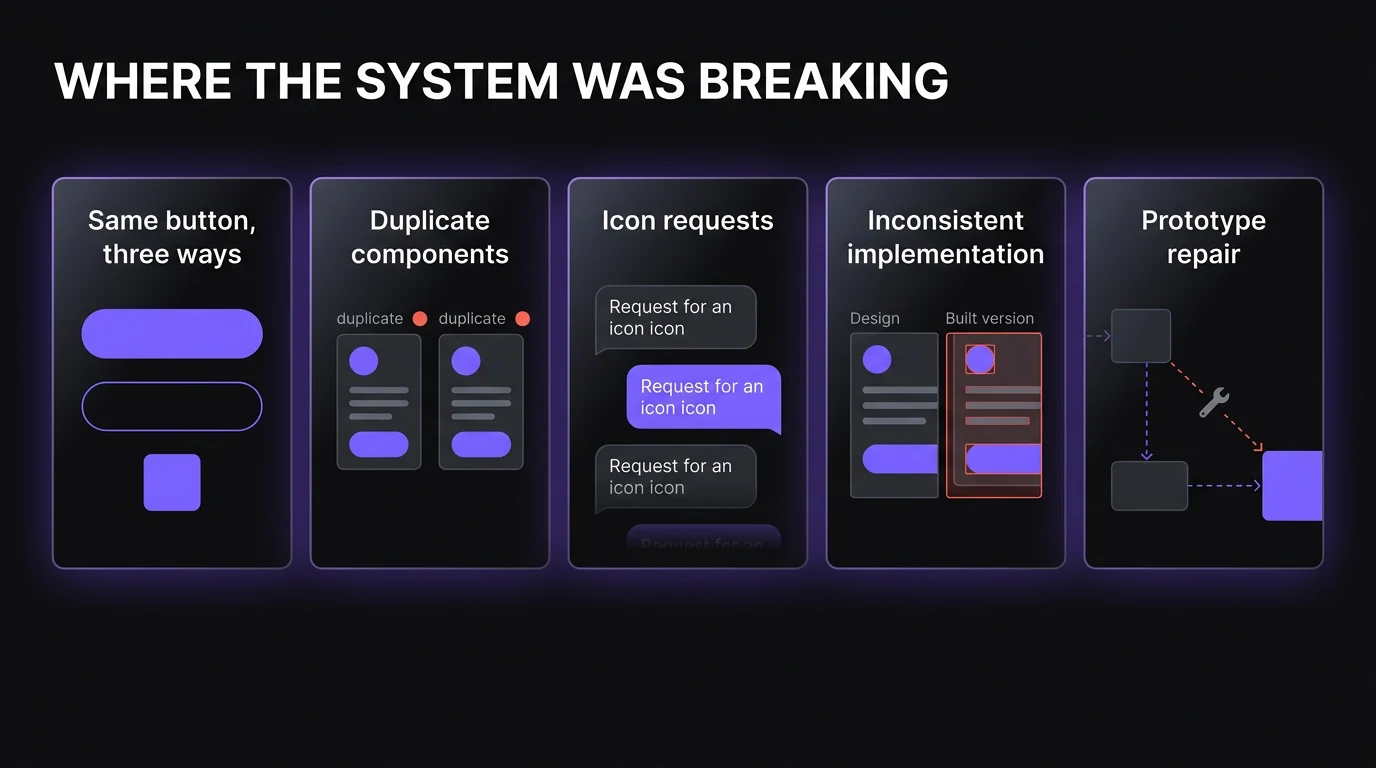
The cracks were already visible in our existing products. Design and development could drift apart, similar elements were rebuilt differently, and even basic assets such as icons repeatedly came back to the design team.
DigiLawyer made the problem harder to ignore. I was designing screens and prototyping at the same time, so copying an existing flow often meant manually checking the UI and repairing prototype connections again.
OPPORTUNITY
What if we built the system without stopping the product?
I proposed building a proper design system, but the business had an immediate constraint: developers needed screens. So instead of pausing delivery, I proposed building both in parallel.
Consistency
Repeated decisions become reusable components instead of being recreated screen by screen.
Faster handoff
Designers and developers work from the same definitions instead of correcting differences during QA.
A reusable foundation
A new product can start from an existing system, then change its theme and product-specific patterns rather than starting from zero.
SOLUTION
Build the system from the product, not beside it.
Whenever DigiLawyer needed a component that didn't exist, I first completed that component properly in the shared library, then used it in the product.
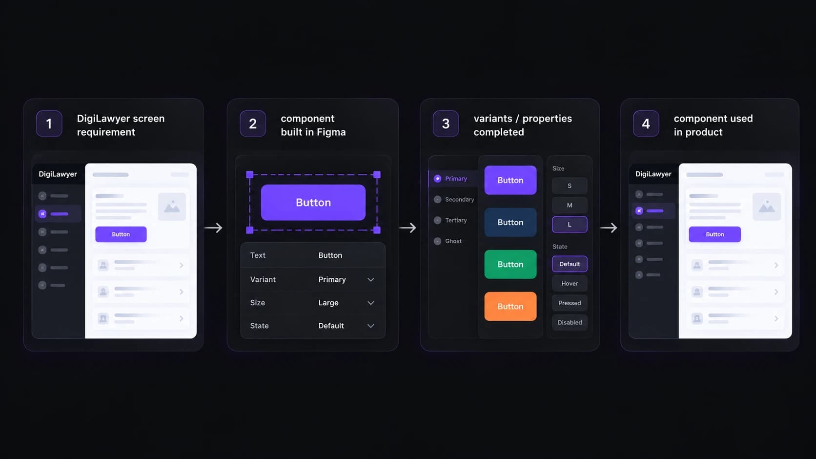
...turning every new requirement into something the next screen could reuse.
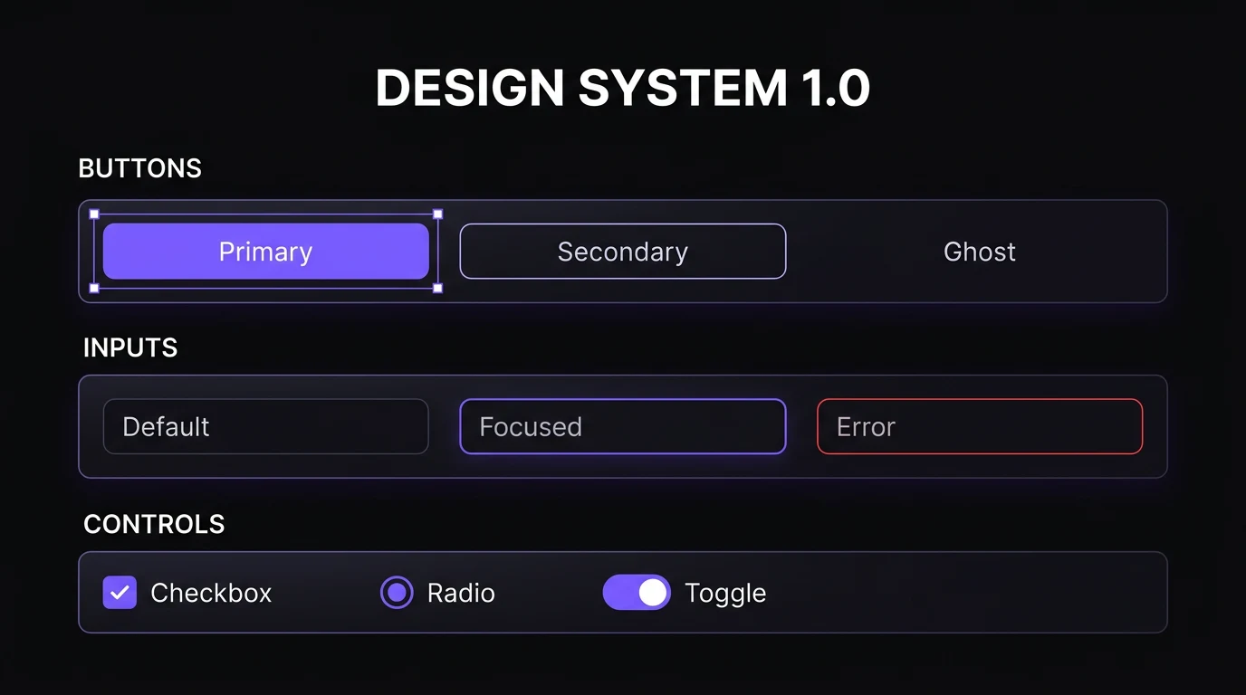
Over roughly two to three months, this production-led approach turned a small library of buttons and fields into the first functional version of the system while the dashboard continued moving forward.
HOW THE SYSTEM WORKED
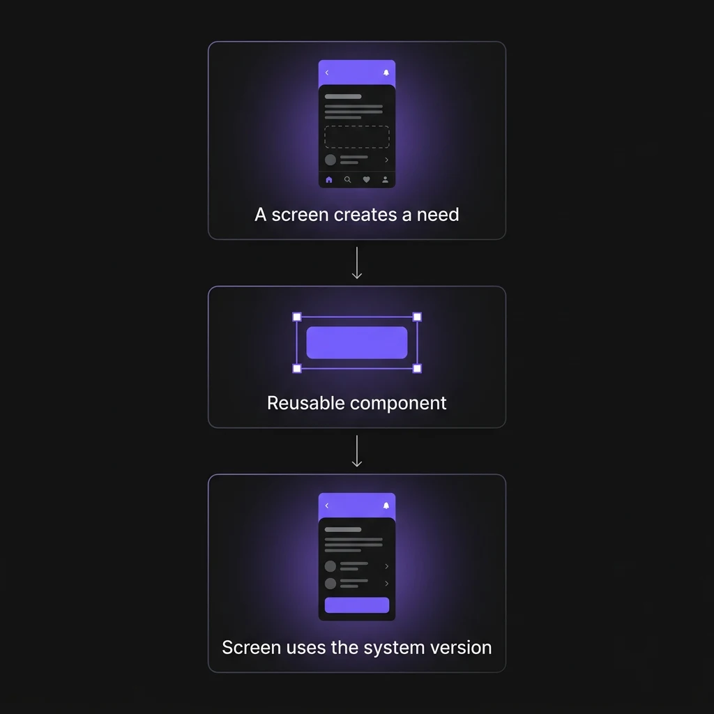
Build from real requirements
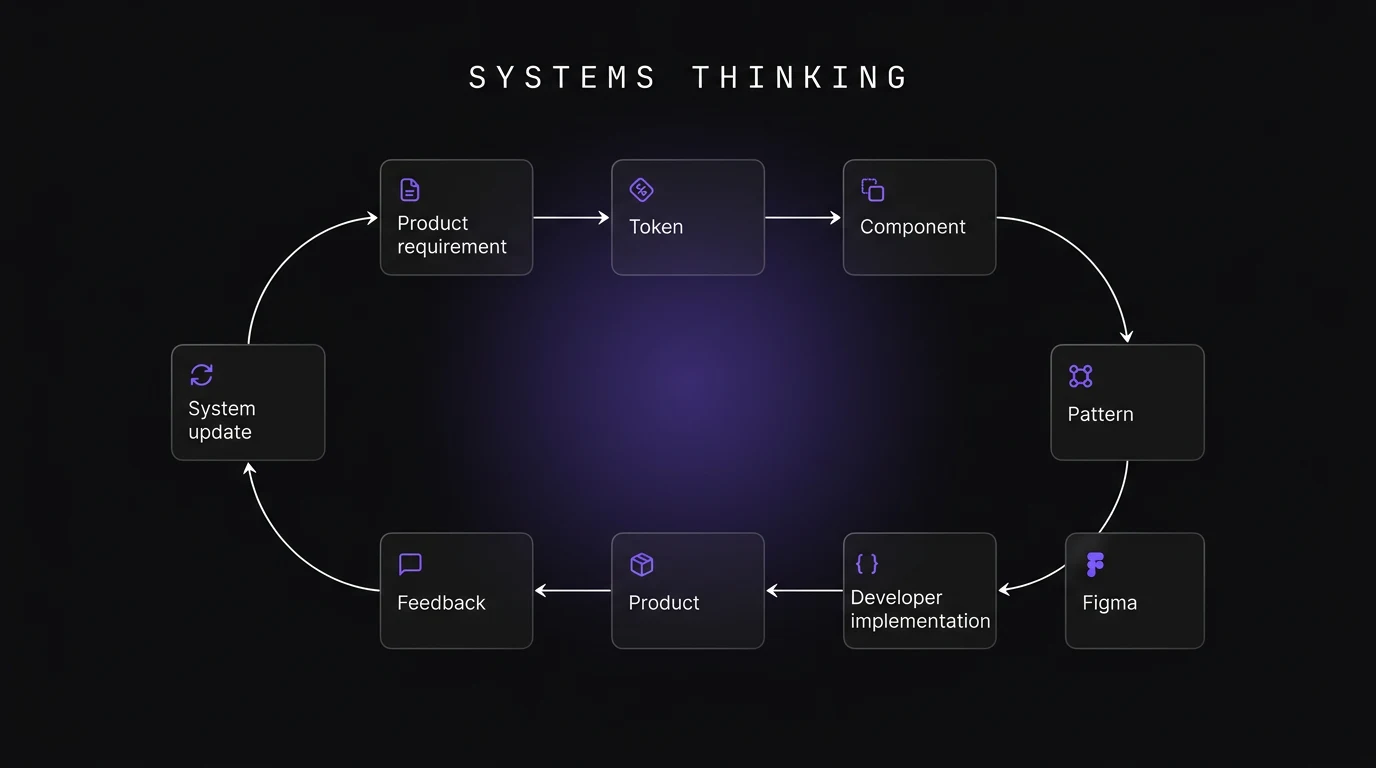
A screen creates a need → the pattern becomes a reusable component → the screen consumes the system version.
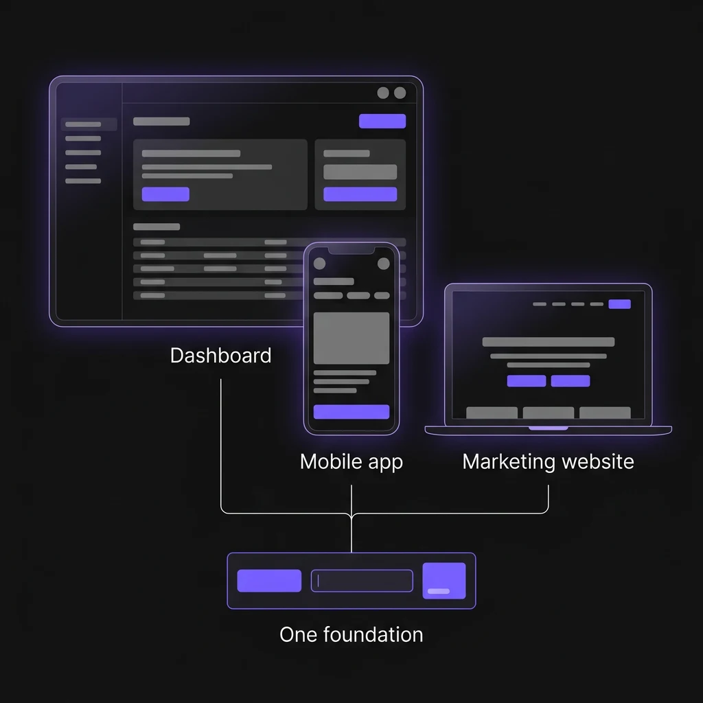
Reuse across surfaces
The same foundation moved from the DigiLawyer dashboard into the mobile application and marketing website instead of being rebuilt for each surface.
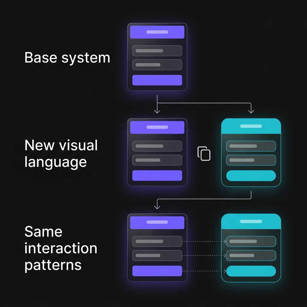
Duplicate for a new product
Once the system worked, we duplicated the foundation, applied the new product's visual language and kept the interaction patterns underneath.
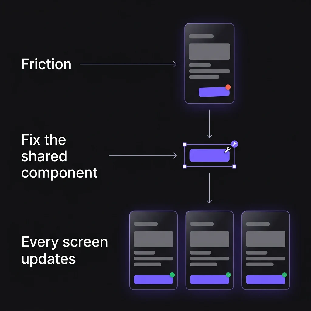
Feed problems back into the system
When another designer or developer hit friction, we fixed the shared component rather than patching one screen.
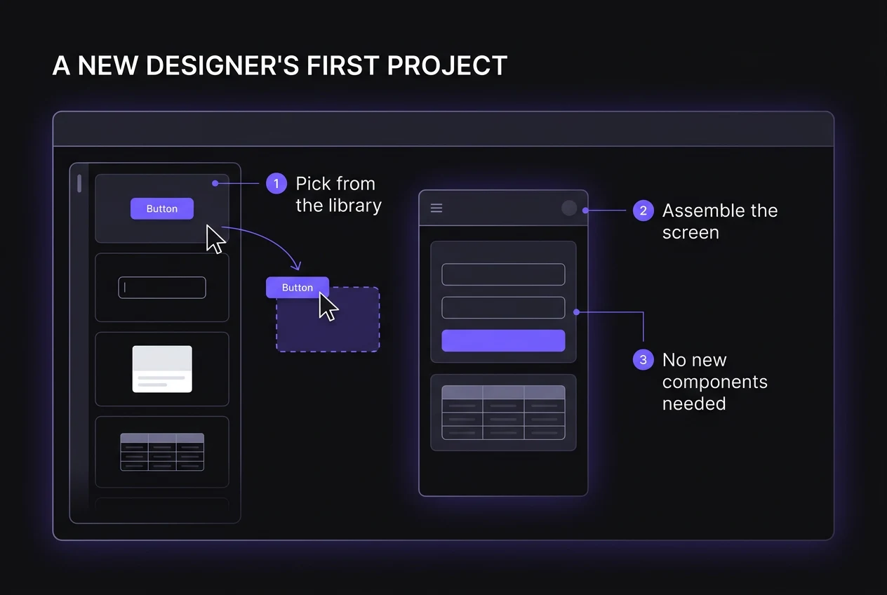
Onboarding designers to the system
When two more designers joined the team, I trained them on how the system worked and used their first projects as a test of whether it could work without me designing every screen.
HOW WE FOUND THE GAPS
The problems were already sitting inside our products and handoffs.
Instead of conducting research in isolation, I looked at how Botshot, Costimizer and DigiLawyer were actually being designed and built: where components diverged, where engineering came back with questions and where I repeatedly corrected the same UI decisions.
TESTING HOW FAR THE FOUNDATION COULD STRETCH
Could the same foundation work beyond DigiLawyer?
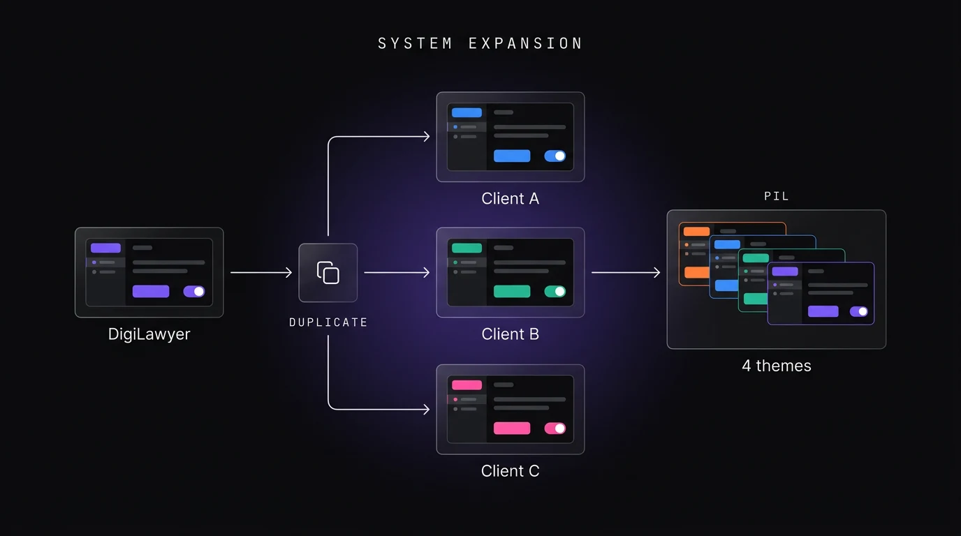
The first real test came when another designer duplicated the DigiLawyer system for a client project. Instead of rebuilding the UI, we adapted the foundation and watched where reuse worked and where the system itself created friction.
WHERE WE TESTED REUSE
DigiLawyer surfaces
Dashboard, mobile application and marketing website built from the same growing foundation.
Client products
Duplicate the base system, change the visual identity and reuse established interaction patterns.
Enterprise theming
Push the architecture further when products require deeper customization, including PIL's four-theme requirement.
WHY REUSE THE SYSTEM?
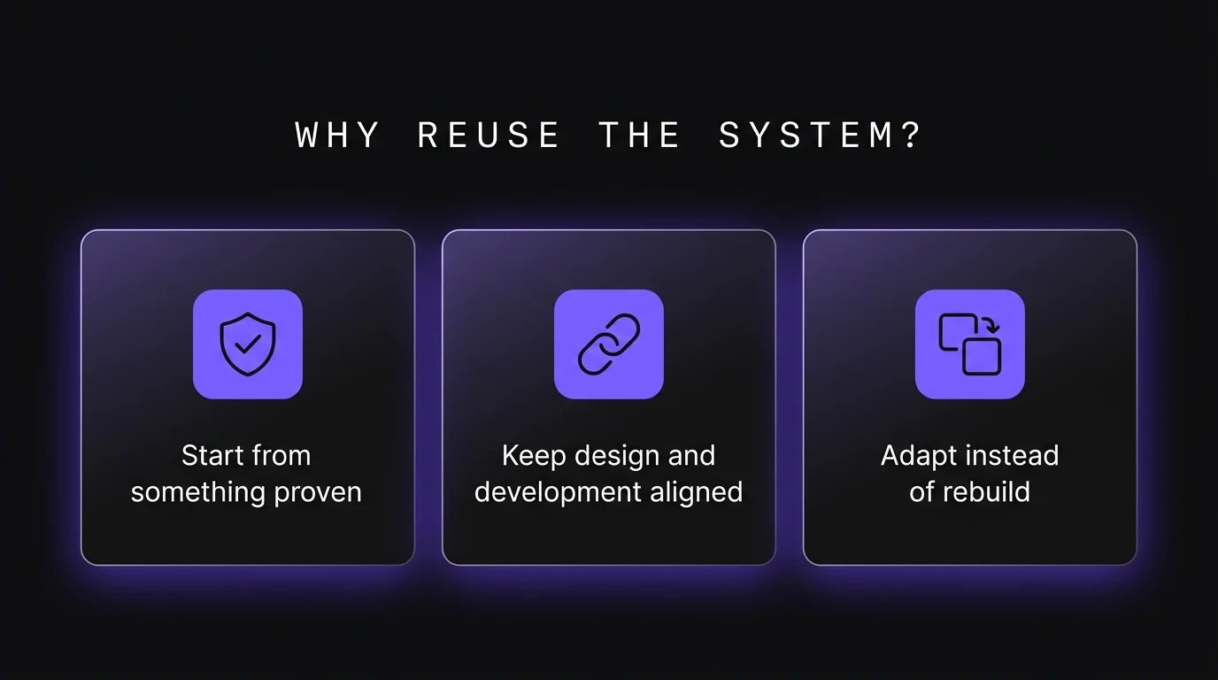
Start from something proven
Teams begin with components and patterns already tested in shipped products.
Keep design and development aligned
The same component language gives both sides a clearer reference for what should ship.
Adapt instead of rebuild
New products inherit the foundation and change what makes them unique instead of recreating common UI.
TESTING THROUGH REAL PROJECTS
The system became useful only when other people could use it.
As more designers and developers worked with the library, their friction became the test of whether the system was actually understandable and reusable.
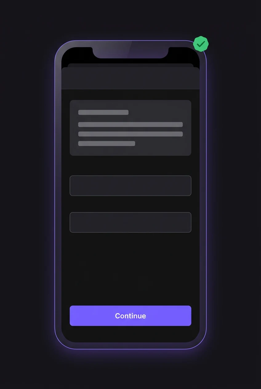
Designer usability
Could another designer choose the right component, size and variant without asking me?
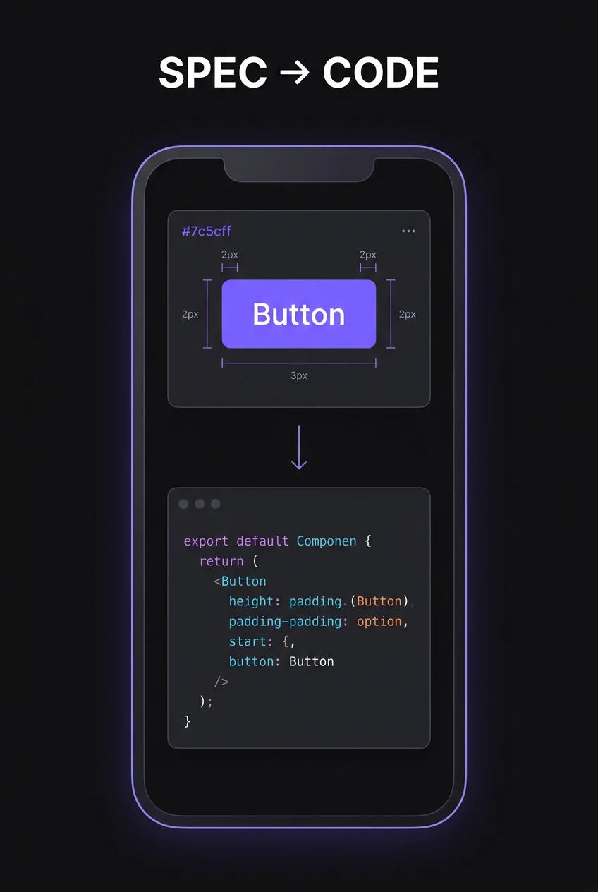
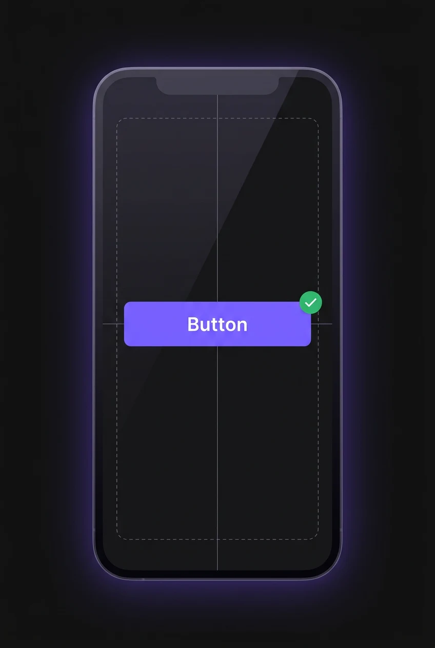
Developer implementation
Could engineering reproduce the intended component behaviour without relying on verbal corrections?
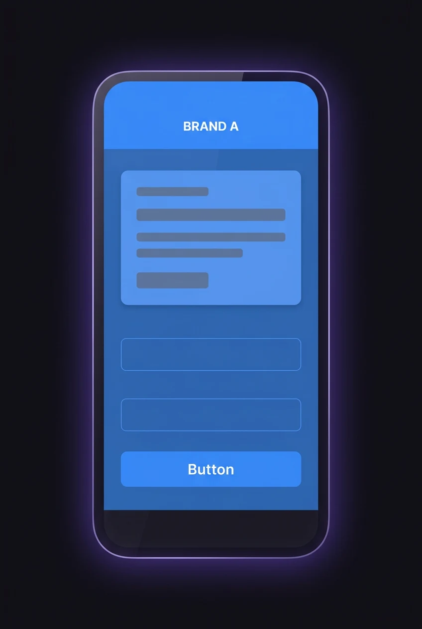
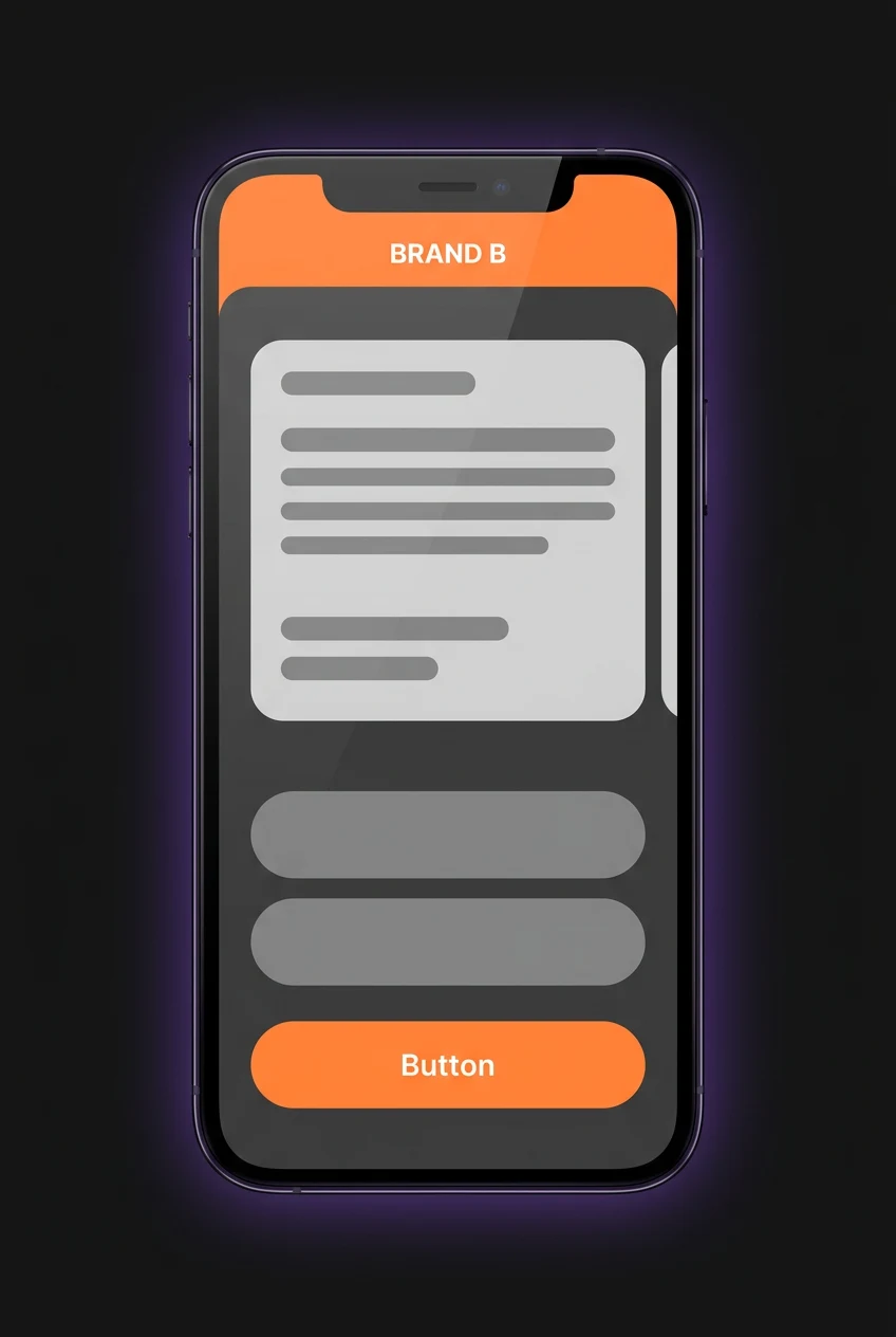
Cross-product reuse
Could the same foundation survive a different brand, product and use case without breaking?
Small feedback changed the system.
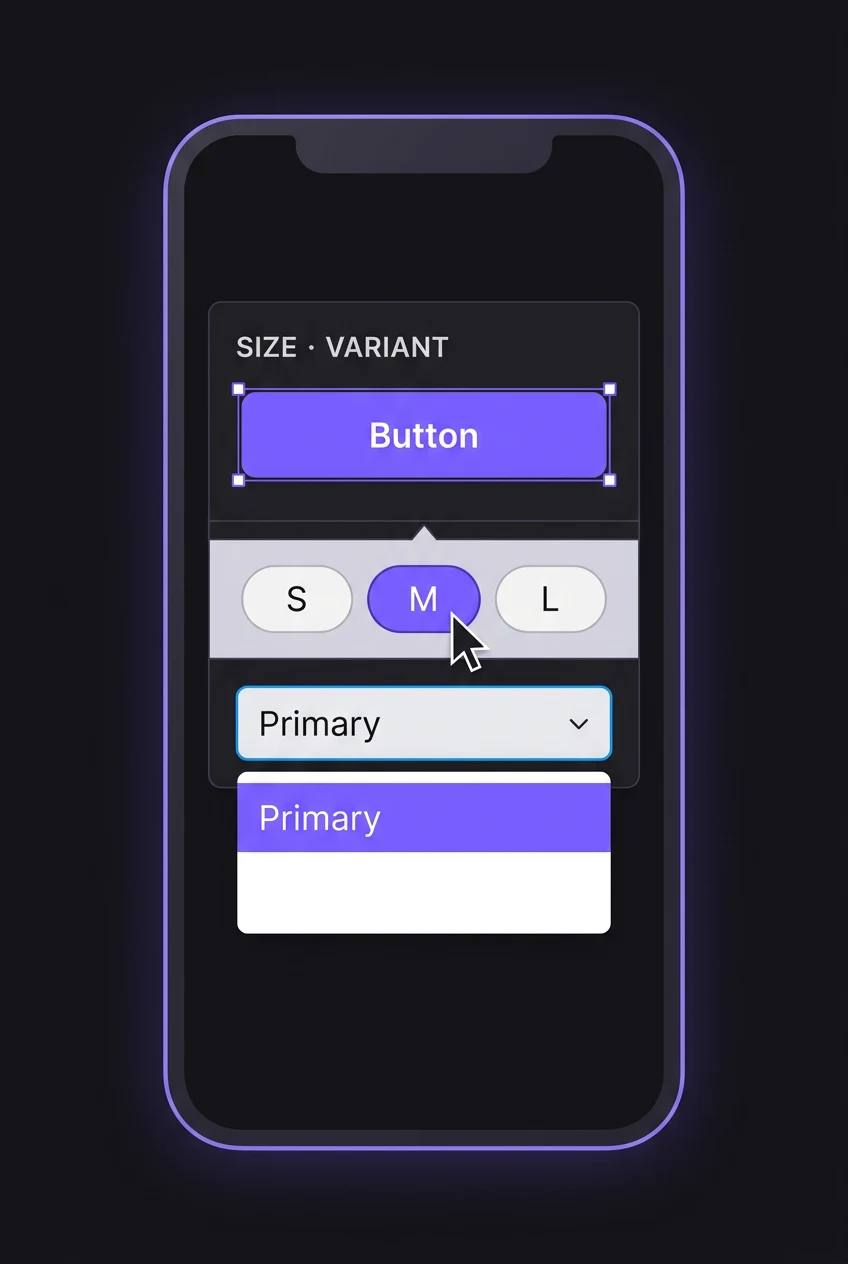
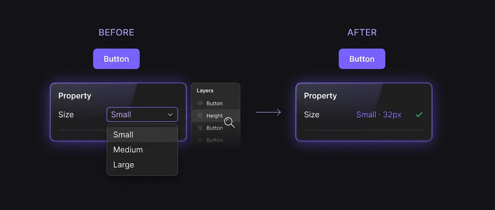
One designer pointed out that a button property only said Small, Medium and Large. To know the actual height, they had to leave the component controls and inspect the layer. It was technically correct, but unnecessarily hard to use.
KEY SYSTEM INSIGHTS
Names should carry the specification
If a button is 32px high, the person using the system shouldn't have to inspect it just to discover that.
The system has to work without me
If using a component requires asking its creator what they meant, the knowledge isn't really inside the system yet.
DESIGN DECISIONS
Every repeated question became something the system should answer itself.
Feedback from designers and developers changed how I named properties, structured variants and documented usage. The goal was to move knowledge out of conversations and into the system itself.
WHERE WE LANDED
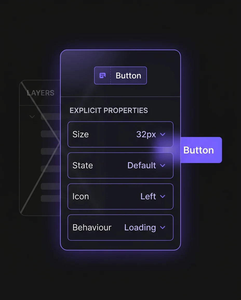
Insight 1: Make the component explain itself
Properties that carry meaning
Sizes, states, icons and behaviour became explicit component properties instead of information hidden inside the layer panel.
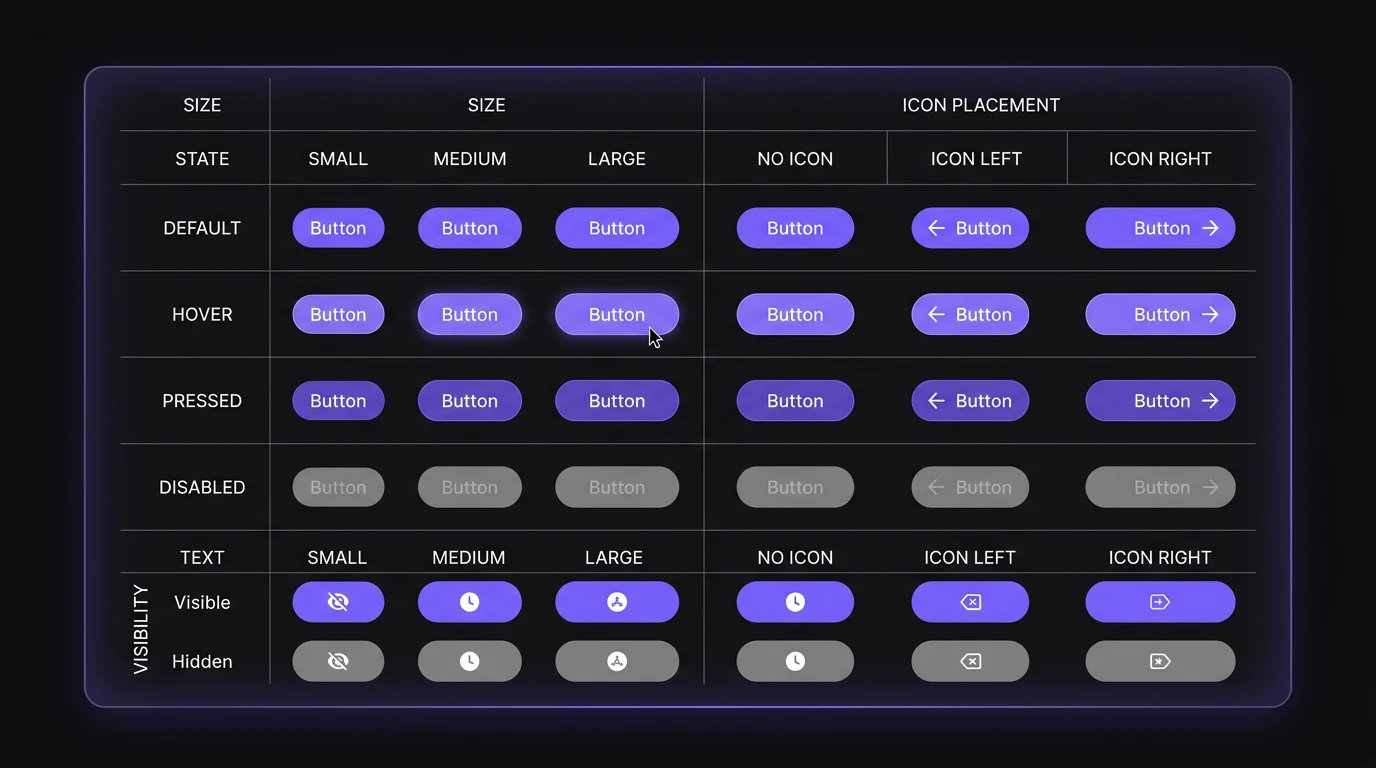
Variants that cover real product use
The button evolved beyond a basic hover state into a reusable component covering size, state, icon placement, text and visibility controls.
Insight 2: Fix the source, not the screen
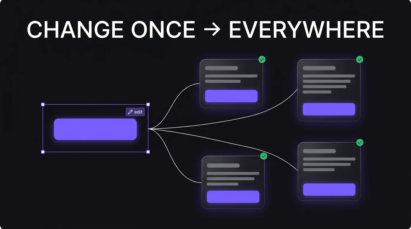
Update once
When a reusable problem appeared, I changed the component in the system rather than correcting every instance manually.
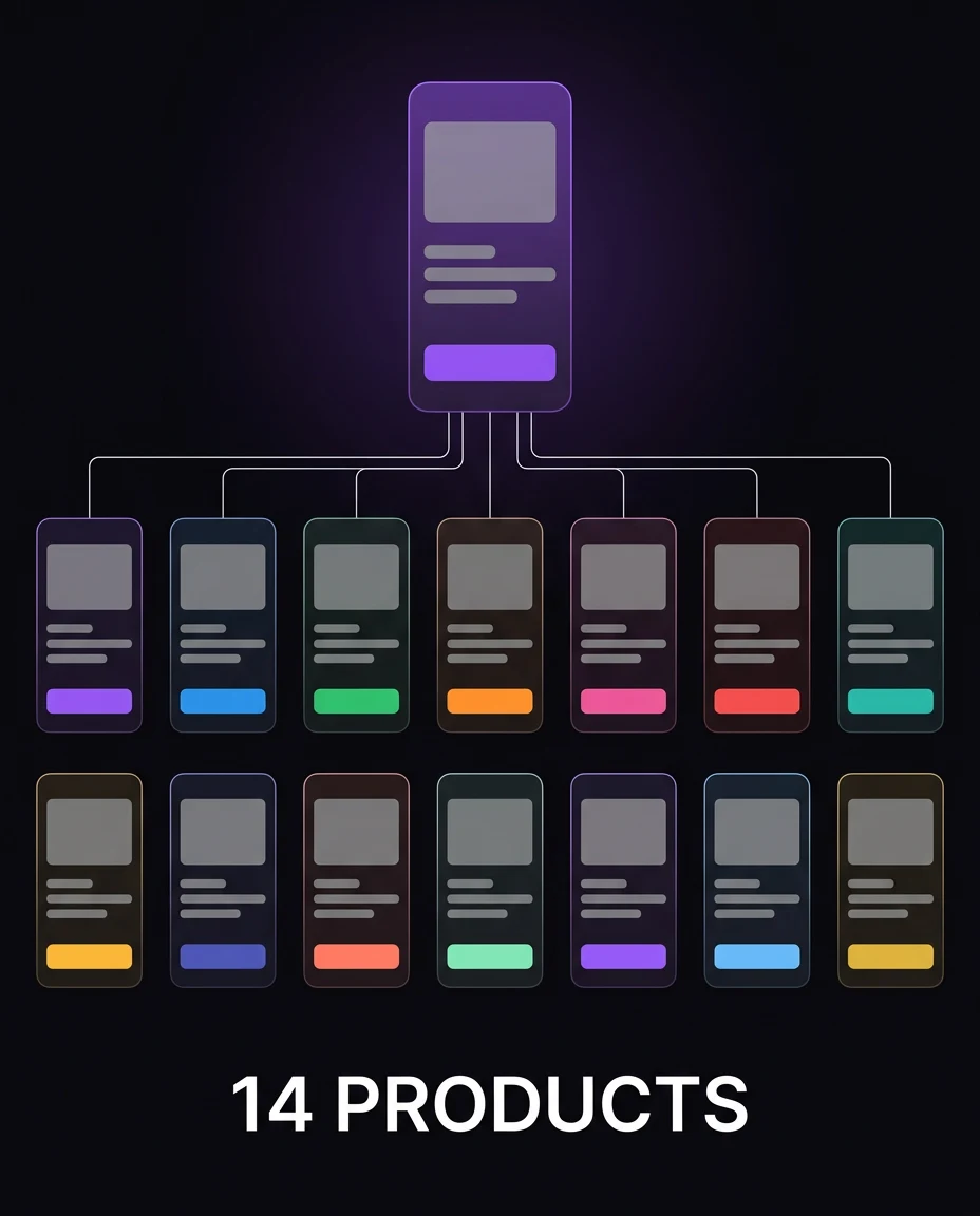
Reuse everywhere
That thinking eventually let the foundation spread beyond DigiLawyer and be reused across 14 products.
WHEN THE FIRST SYSTEM HIT ITS LIMIT
A Figma library wasn't enough anymore.
For a long time, the system worked because I and our tech lead communicated constantly. If something was wrong, I saw it, spoke to him and it was corrected. That hid a structural problem: much of the system still lived in our heads.
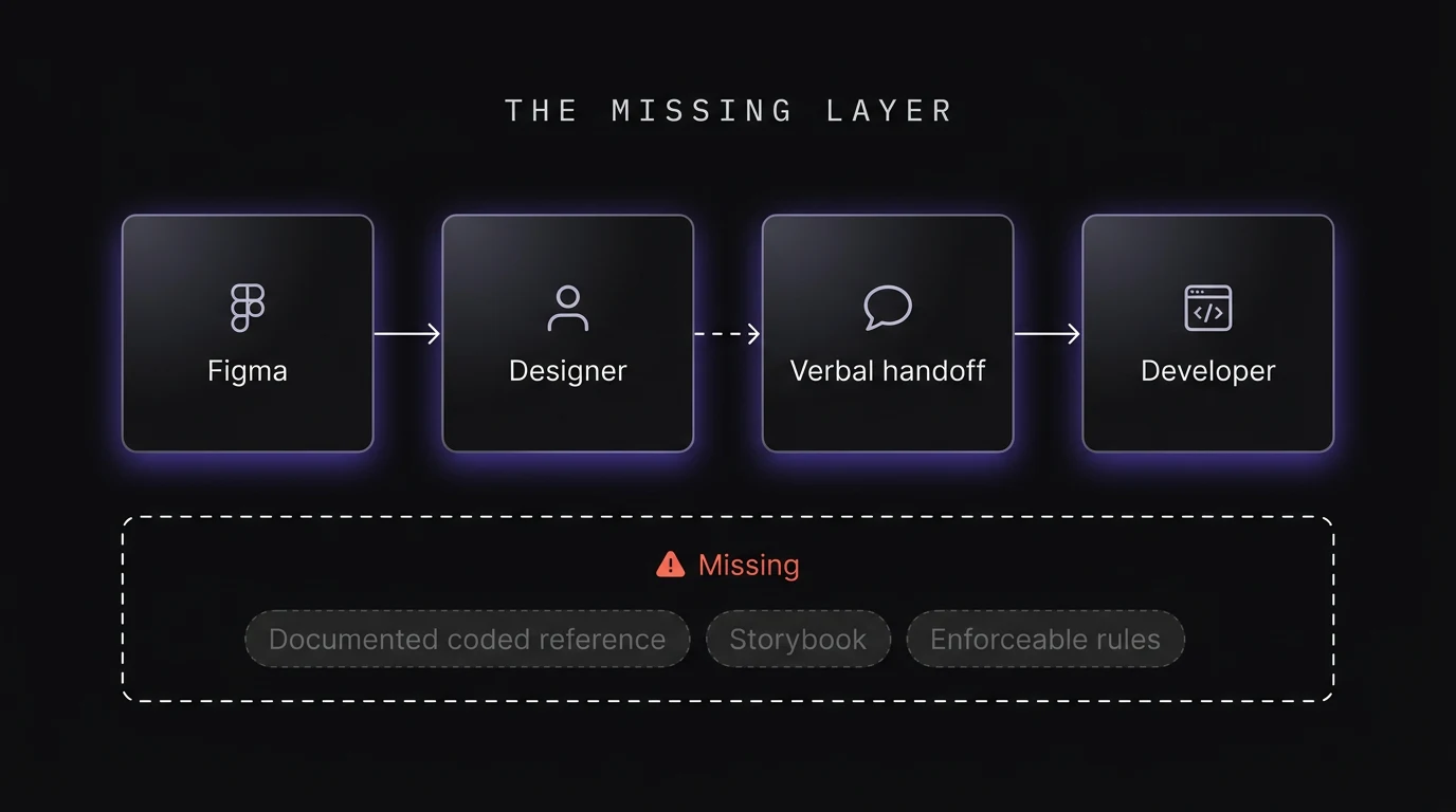
So I had to ask:
How do we make the system work when the people who created it aren't in the room?
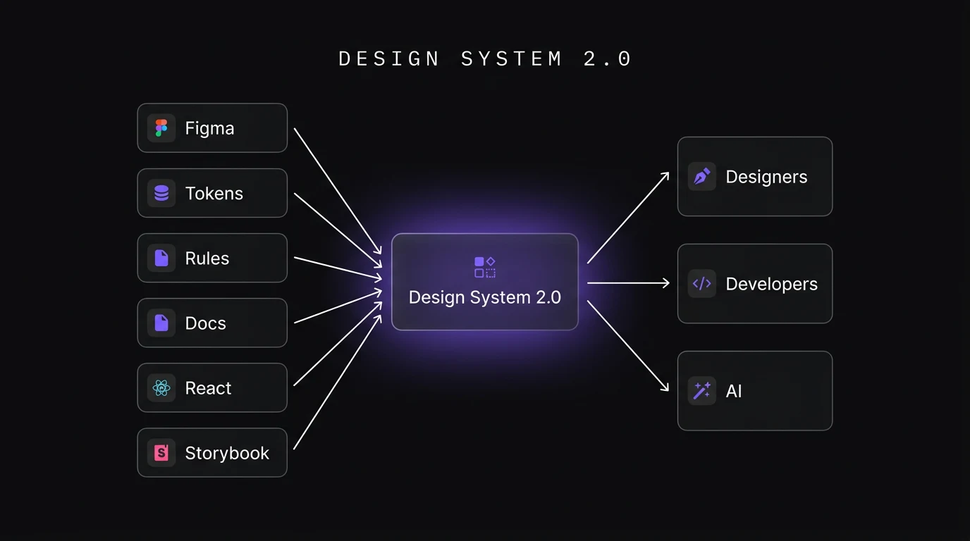
DESIGN SYSTEM 2.0
Move the rules out of our heads.
As designers, developers and AI started participating in the same workflow, components needed anatomy, usage rules, do's and don'ts, accessibility guidance and a coded reference everyone could inspect.
CONSIDERATIONS
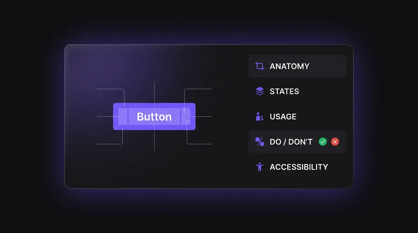
How do we make the rules impossible to miss?
Document each component's anatomy, states, usage, do's and don'ts and accessibility guidance next to the component itself instead of relying on verbal explanation.
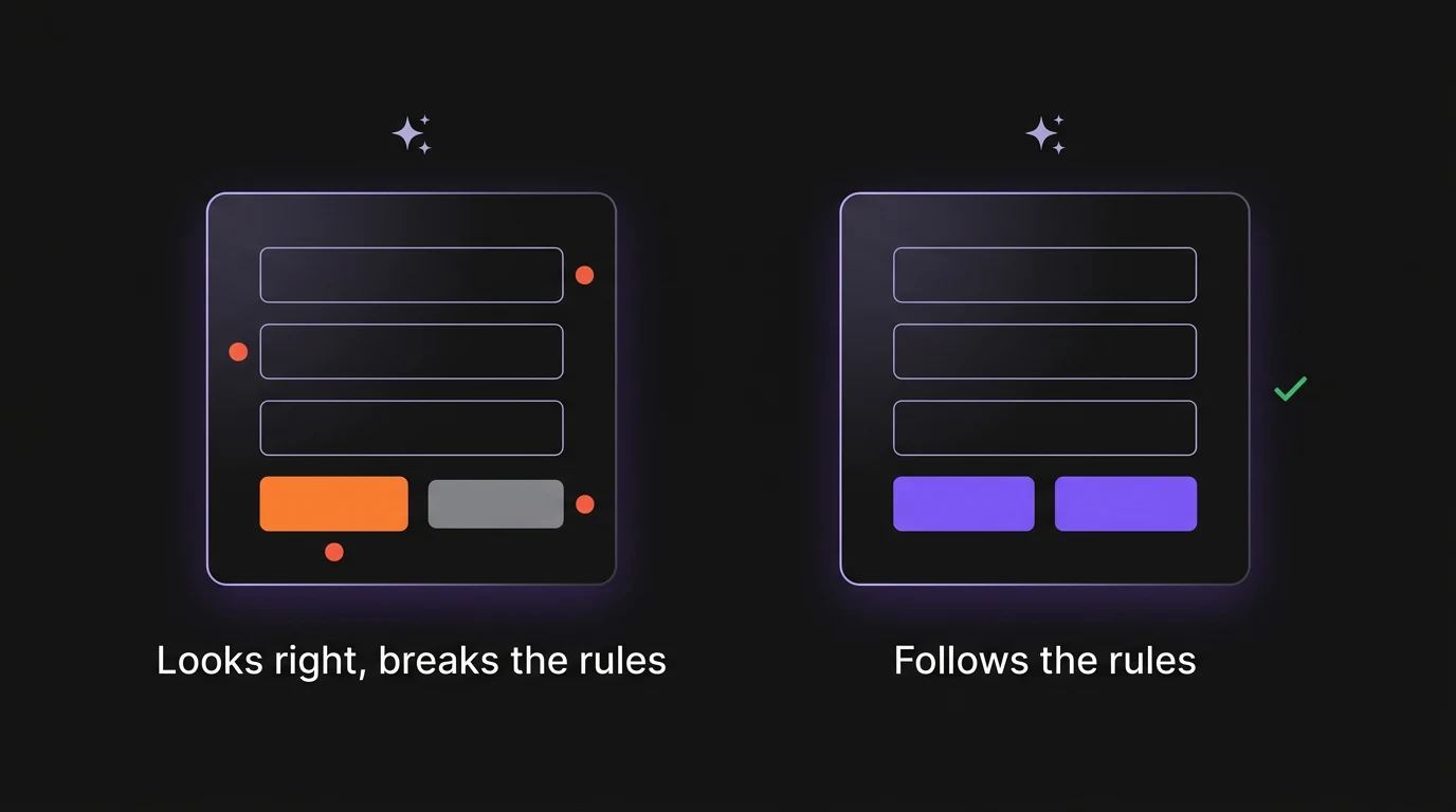
Can AI build from the same rules as the team?
The system needed explicit constraints and patterns so AI wouldn't invent UI simply because the output looked plausible.
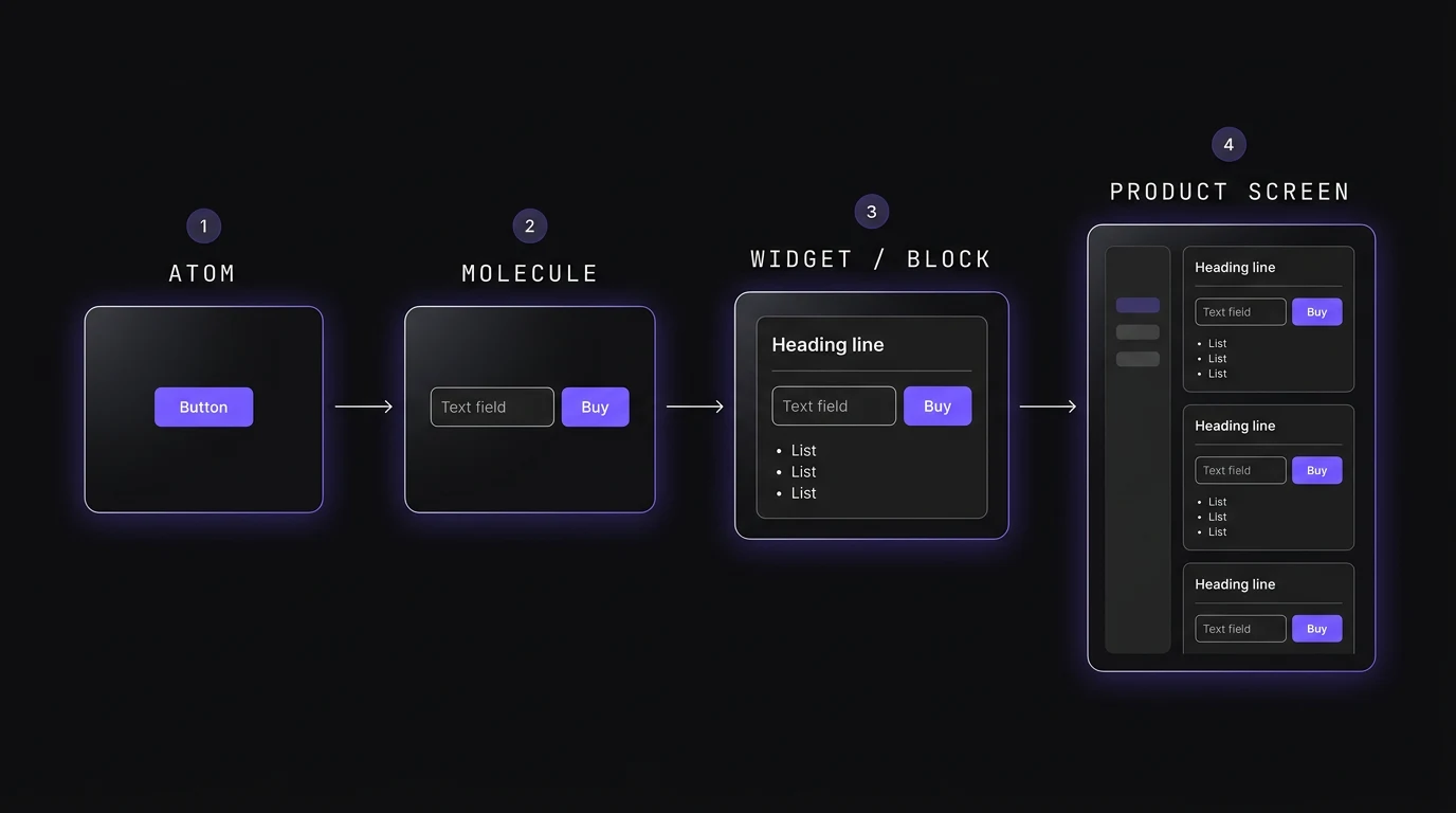
From atoms to blocks
Components solved individual controls, but they still left designers, developers and AI assembling larger sections from scratch. The next step was reusable widgets / blocks built from those components.
CONSIDERATIONS
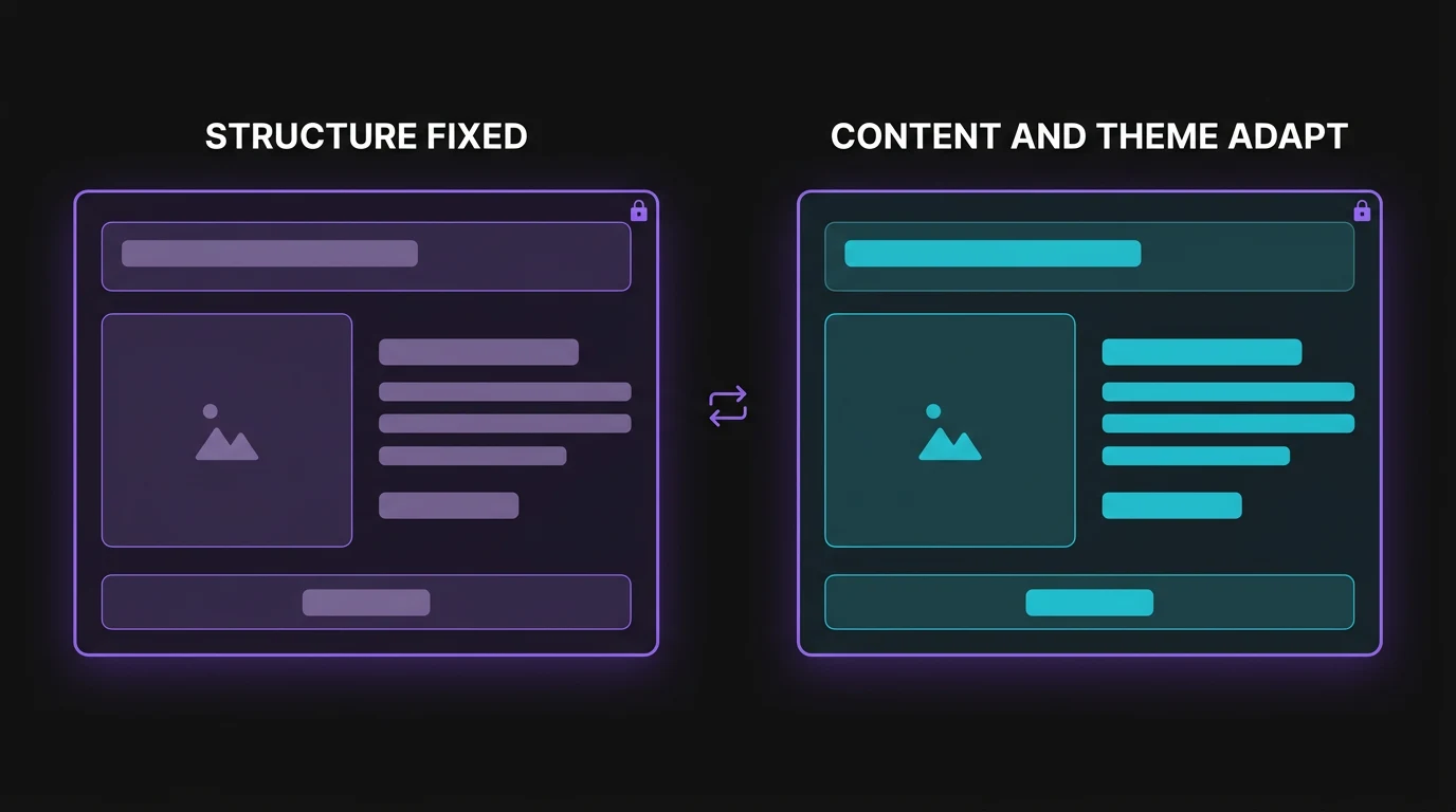
How much should a block decide for the person using it?
The block should remove repeated structural decisions without preventing the product from adapting its content and theme.
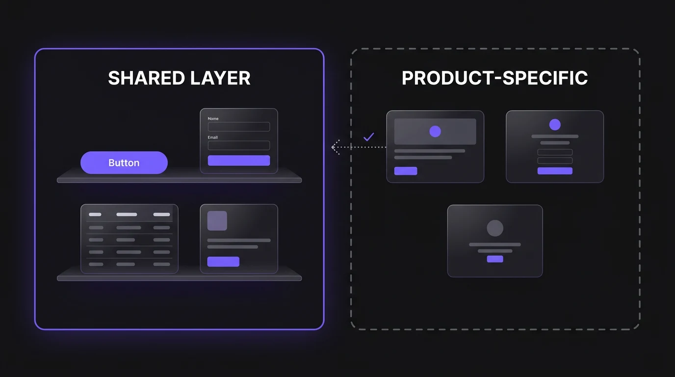
What should stay shared, and what should stay product-specific?
Use the shared layer for patterns we repeatedly need across products, while keeping genuinely product-specific experiences outside it until they prove reusable.
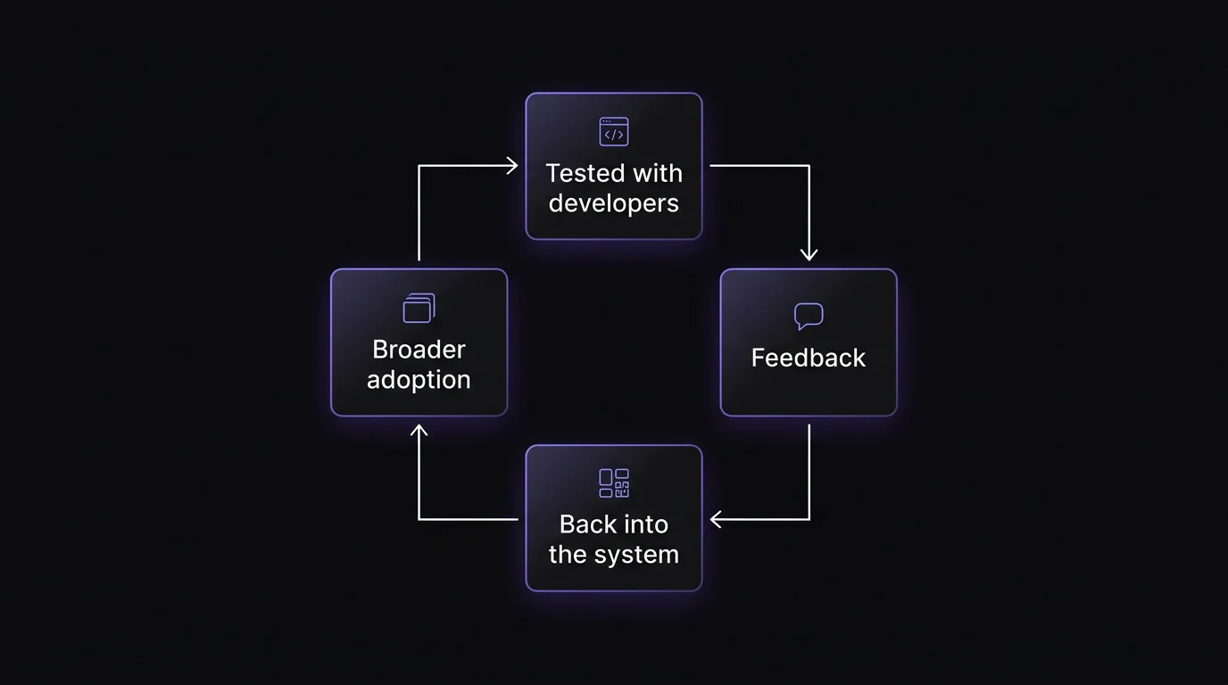
How do we know the blocks work in production?
The current blocks/widgets are being tested with developers, with functionality and implementation feedback feeding back into the system before broader adoption.
Trading one-off freedom for shared consistency
A shared system intentionally removes some one-off decisions. The trade-off is less freedom to reinvent common patterns, in exchange for a product language that is easier for designers, developers and AI to understand and maintain.
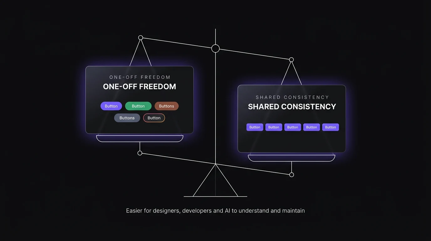
Consistency only matters if the system is still flexible enough for the product.
REFLECTION
What I learned
Sometimes the customer problem starts with our own infrastructure.
We knew what users needed, but there were moments when the way our own team designed and built products limited how quickly we could give it to them. Fixing that internal system became part of solving the customer problem.
Think beyond the Figma file.
A design system isn't finished when the components look right. It has to work for the designer using it, the developer implementing it, the new teammate learning it and now the AI generating from it. Done isn't where I stand. It's where the person using my work stands.
SELECTED WORK
Morecasestudies
- 2025–26 · DIGILAWYERDigiLawyer's challan page needed a phone call to sell. Now 3 in 5 paying customers never need one.B2CLegal TechConversionMobile-first27% → 42% of visits start a checkWith Nitansh Anand and the CEOFour form fields cut to oneView case study