THE SITUATION
The designs were consistent. The product wasn't.
I had defined primary, secondary and tertiary buttons, and a rule for when each applied. What shipped paired primary with secondary where the pattern called for primary and tertiary. It wasn't carelessness. There was nothing to check the build against.
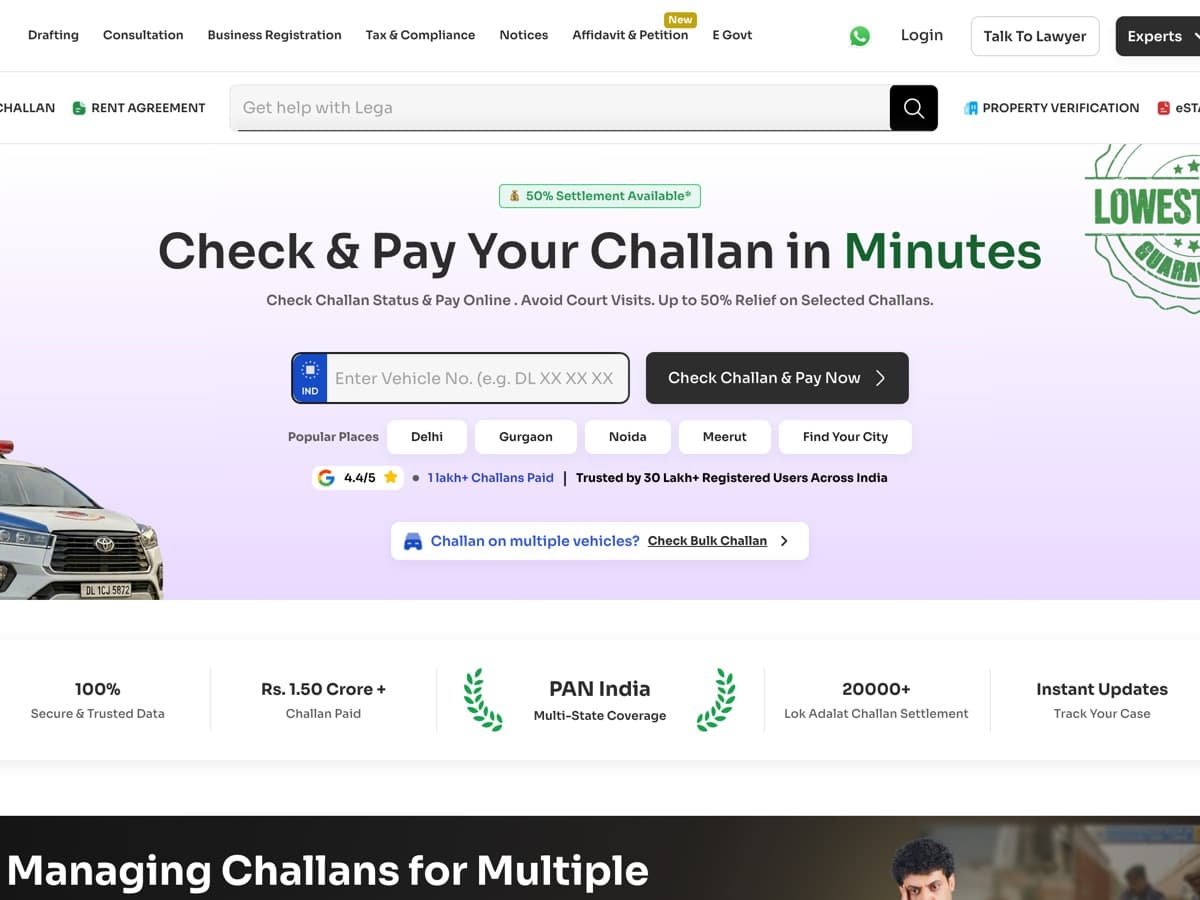
These were not marketing pages: people use DigiLawyer to serve legal notices, sign agreements and e-stamp documents across twenty-plus states.
CORE CHALLENGE
Give the build something to check against — and make it the easiest thing to reach for.
THE USERS
Everyone who builds on it.
01
Developers
They need the system in the codebase, not in a Figma file.
02
Designers
The team that grew around me — two designers who had to use it without asking me.
03
Our CEO
Technical, and interested only in what reaches production.
PAIN POINTS
Nothing to check the build against.
01
No source of truth
The reference was whatever shipped last.
02
Verbal handoff
Every correction was a conversation, and conversations leave no record.
03
No shared vocabulary
I said “tertiary”. Nothing made tertiary mean one specific thing.
04
Fourteen frozen copies
New projects copied DigiLawyer's code, so every fix stayed where I made it.
05
AI copying hex codes
Handing Figma to a model gave sharp output that was fundamentally wrong.
THE PROBLEM
Every review turned into a bug hunt.
My time and my engineer's went into reconciling interface details instead of shipping the product. That is the argument I took to our CEO.
DESIGN GOALS
Design goals
01
Done means installable
Not finished until a developer can npm install it.
02
One source of truth
Every component from variables, every variable bound to a token.
03
Names that carry the spec
XL (48px), not XL — nobody should have to click to find out.
04
Rules before anything is touched
Written into the repository, so AI and people follow them first.
SOLUTION
The stack, one layer deeper each time
01
Design tokens
Primitive, semantic, component — three tiers.
02
Figma components
Light and dark.
03
Documentation site
Every component, every state, versioned, with a changelog.
04
React components
The same 25, built a second time.
05
Storybook
The library, live and interactive.
06
Published npm package
Installed like any other dependency.
COMPONENTS
25 components
- Button
- Button Group
- Checkbox
- Radio Button
- Toggle Switch
- Dropdown
- Text Input
- Text Area
- Upload Media
- Slider
- Rating
- Date Picker
- Options
- Avatar
- Alert
- Badge
- Breadcrumb
- Link
- Pagination
- Progress Bar
- Snackbar
- Table
- Tabs
DECISIONS & TRADE-OFFS
Key decisions and trade-offs
01Three token tiers, not a flat list
Decision
A flat list of named colours was faster and would have cleared the duplication in front of me. It breaks on the first rename.
Trade-off
A layer of indirection — two hops before you reach a hex. It buys that reassigning a colour never touches a component.
02Port one-to-one, improve nothing
Decision
I built all 25 components a second time in React without fixing anything on the way, so the second build worked as an audit of the first.
Trade-off
Twenty-five components again, with no visible progress to show for it.
03Pitch it as variables
Decision
Our CEO thinks in code, so I described the system as what his developers already did with variables. His condition: show me in a week.
Trade-off
Five components in seven days, then three more months for the first working system — with no dedicated time.
04Keep going when told it wasn't my job
Decision
A senior developer said Storybook, React and the docs weren't a designer's part. I built them anyway.
Trade-off
Done isn't where I stand. It's where the person using my work stands.
PROCESS
From discovery to handoff
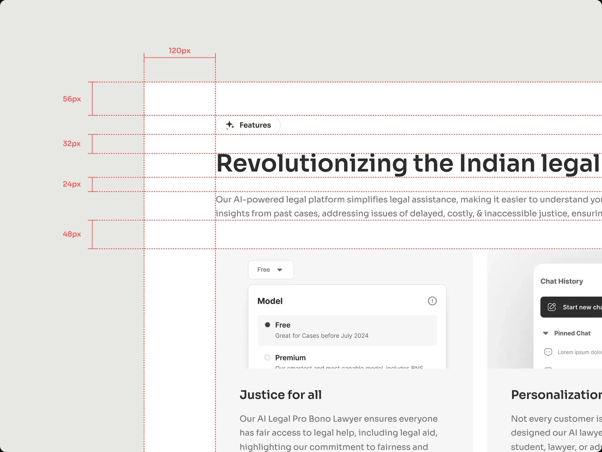
SPACINGSection rhythm: 120px margin, 56 · 32 · 24 · 48 steps 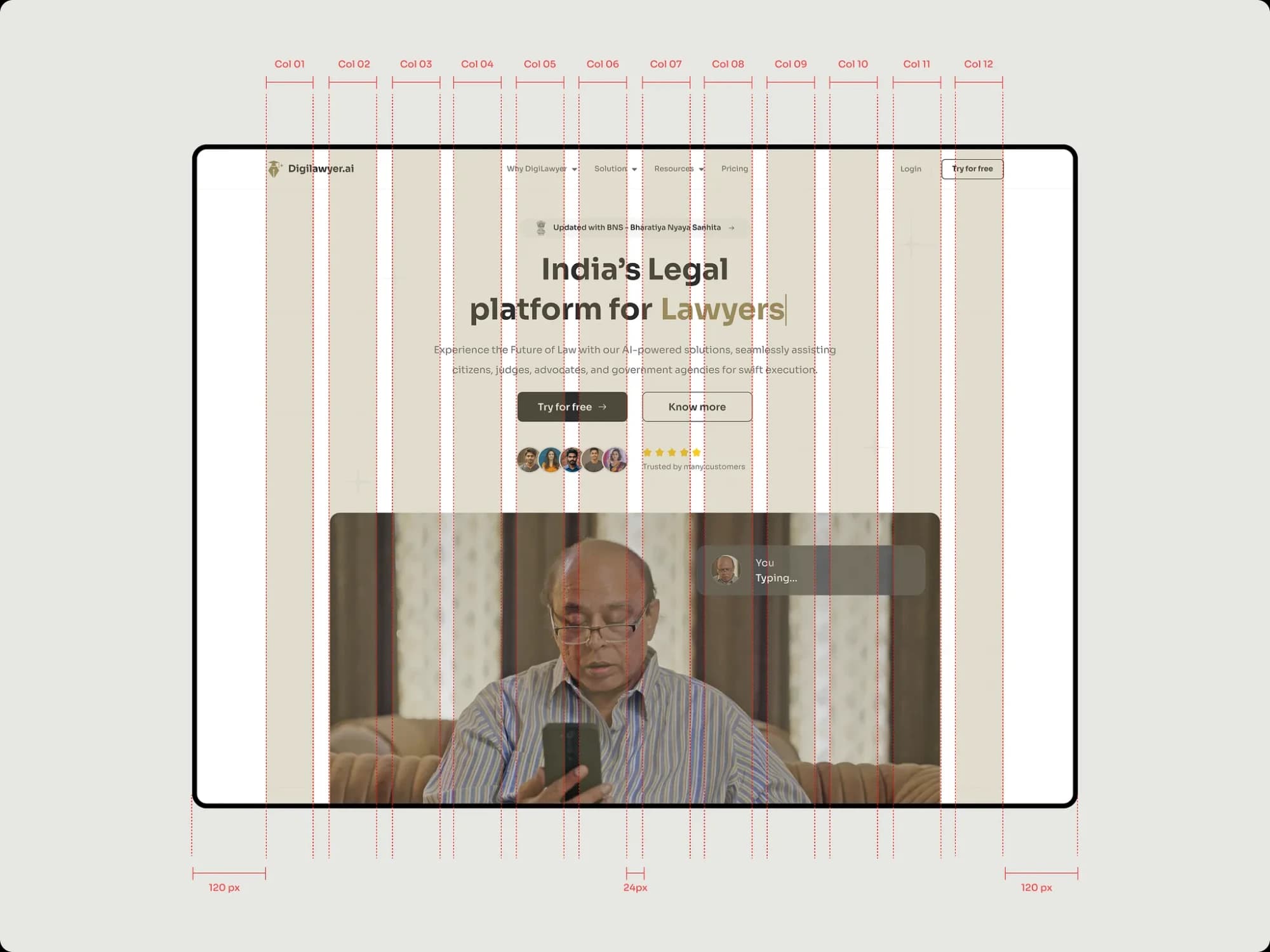
GRID12 columns, 120px margins, 24px gutters 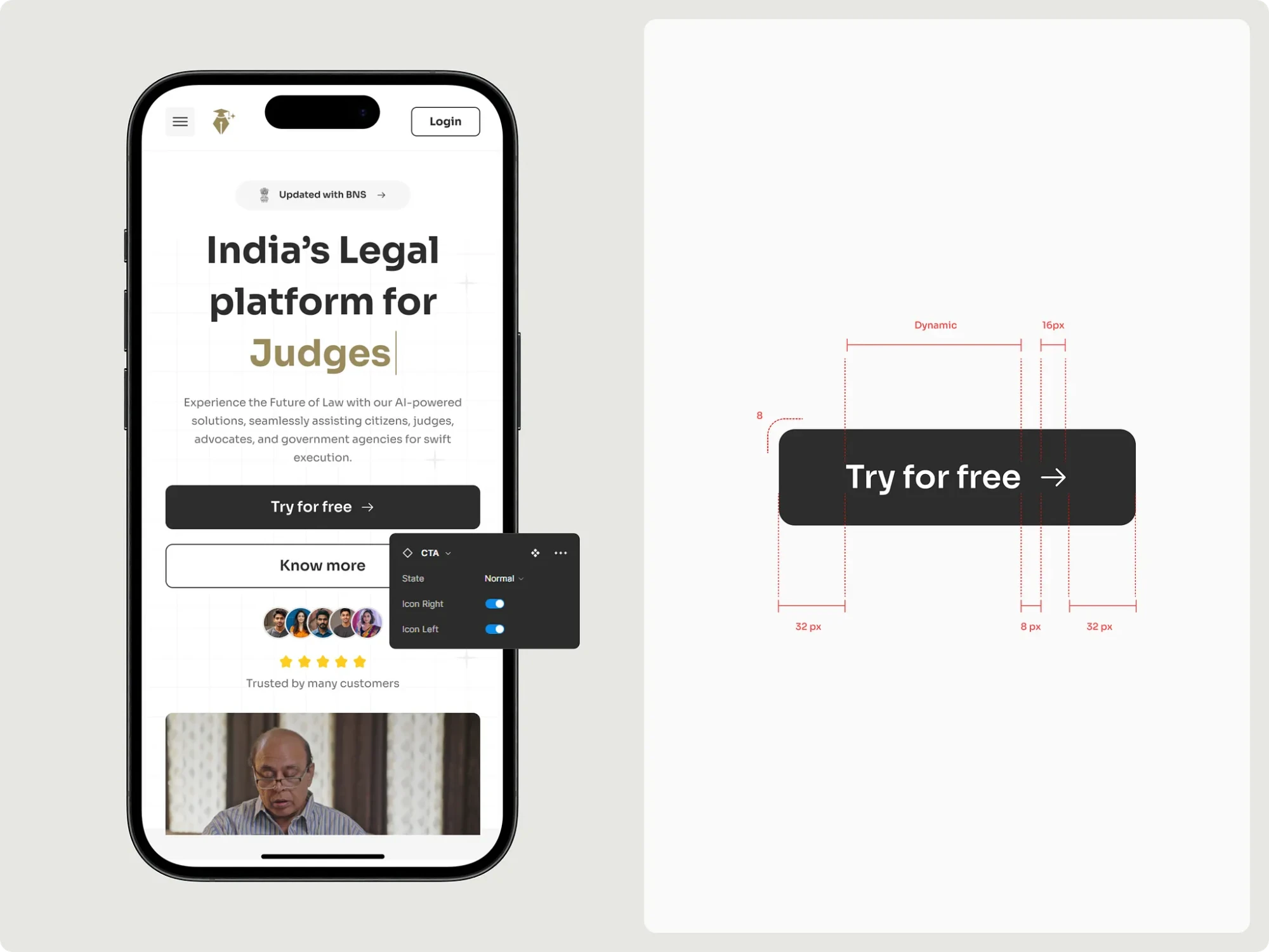
COMPONENTThe CTA: 32px padding, 8px icon gap, icon left or right 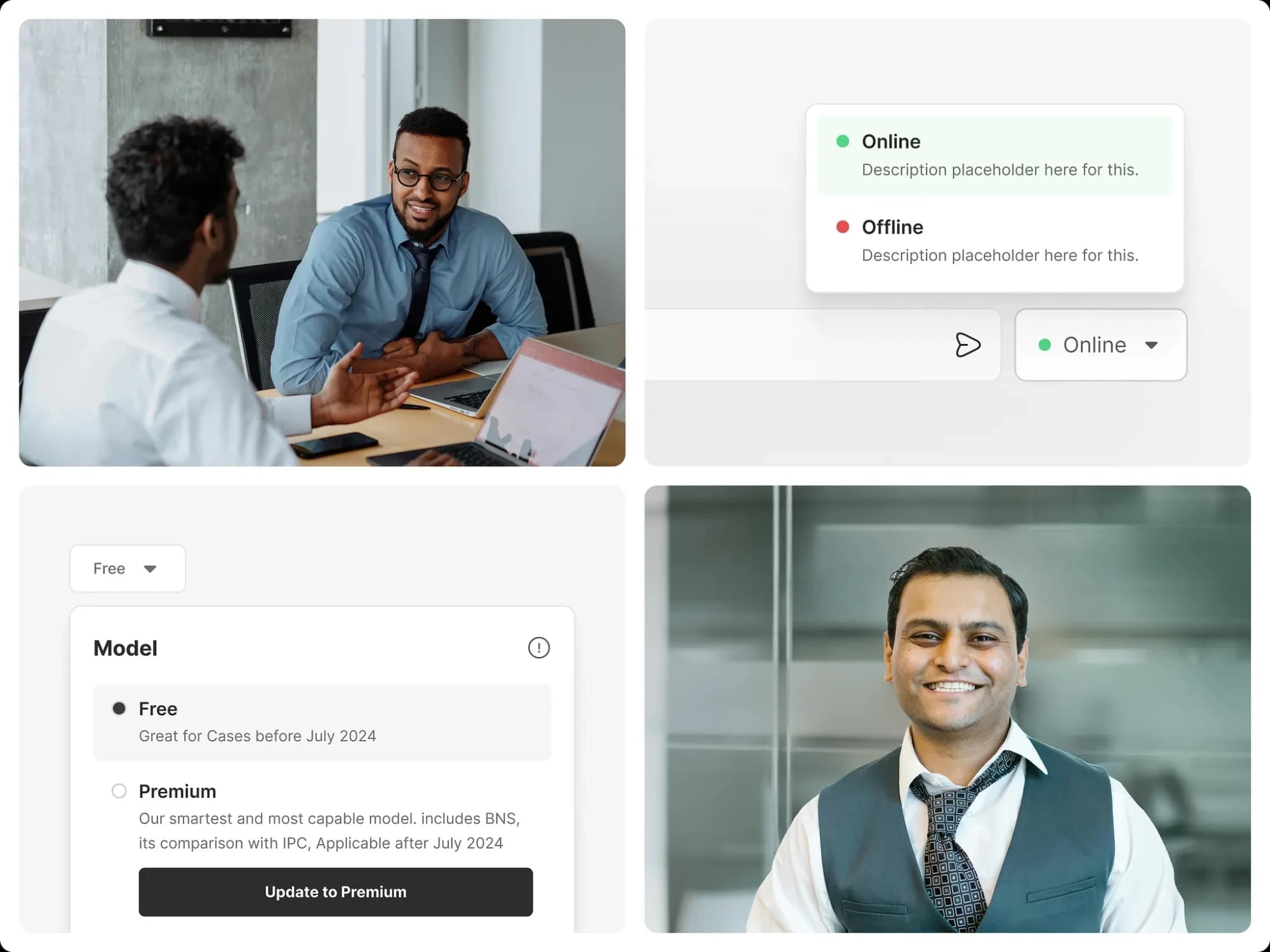
IN USEComponents in the product: status, model picker 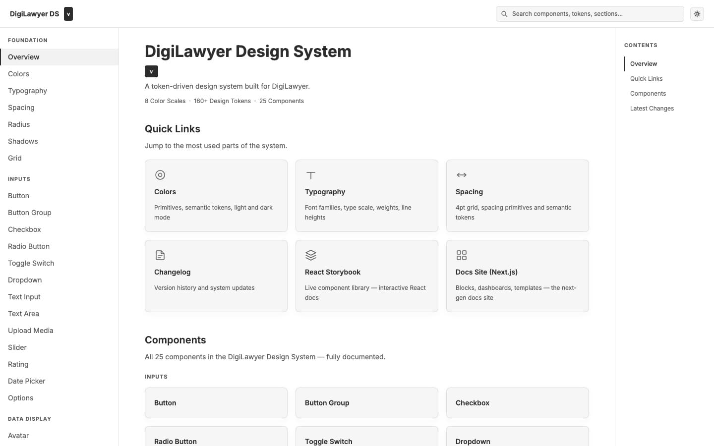
DOCSThe documentation site 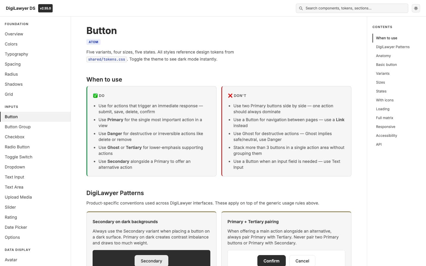
BUTTONButton: the Primary + Tertiary rule 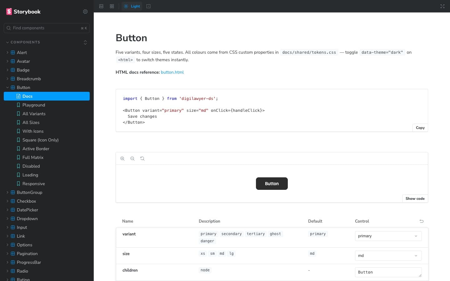
STORYBOOKButton in Storybook
OUTCOMES
The bug tickets dried up
COMPONENTS
25
DESIGN TOKENS
160+
VERSIONED RELEASES
130
PRODUCTS BUILT ON IT
14
Today 3 designers work in the Figma library and 20+ developers build with the React package. The tokens, components and releases give 14 themed variants for 14 products, and setting up a design system for a new product went from one or two months to about 30 minutes. The conversation I took to our CEO — engineering and I reconciling UI instead of building features — stopped happening. A fix is published once and reaches every product. Observed across the months after adoption, not tracked on a dashboard; the numbers above are instrumented, in the public repo.
REFLECTION
Done isn't where I stand
REFLECTION
A design system isn't finished when it looks right in Figma. Done isn't where I stand. It's where the person using my work stands.
What's next: blocks
Pick a hero from ten versions, copy it, paste it into a project that already has the package, change the content. A section live in ten minutes instead of an afternoon.